Inner Luminary
-
The founder of Inner Lumiary came to me to build out her brand from start to finish, from the brand name (Inner Luminary), to logo designs, developing brand assets, and fine-tuning the brand voice and language used throughout marketing materials.
-
Brand design and brand identity.
-
Inner Luminary provides spiritual guidance for people to step into their authentic selves.

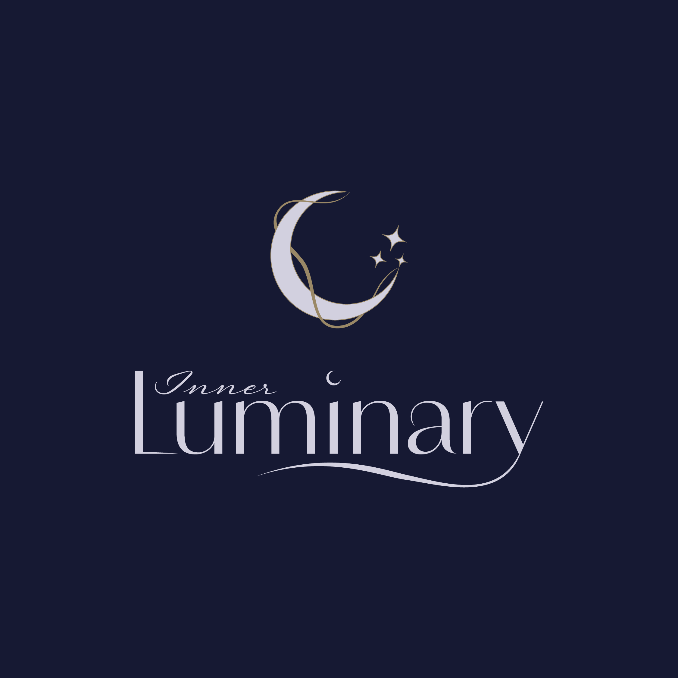


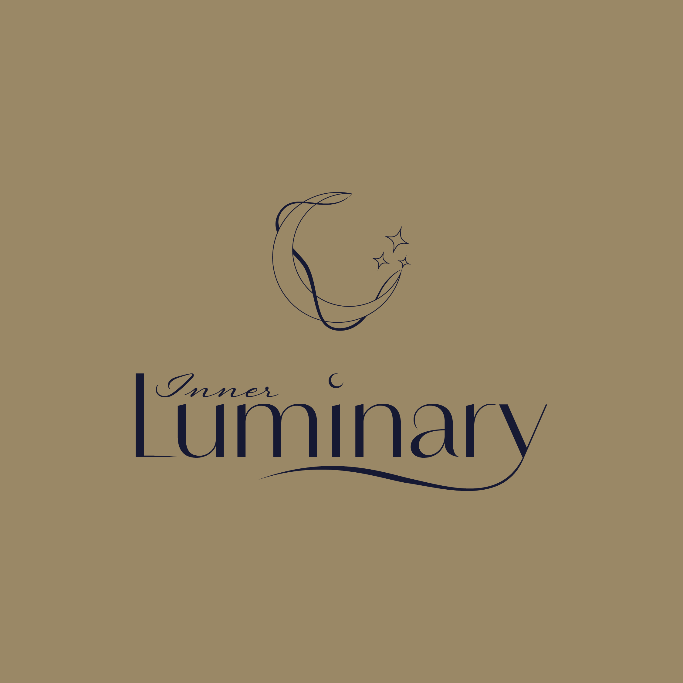


Logo Variations
Inner Luminary offers profound spiritual guidance, empowering individuals to flourish while fostering connections to oneself, others, the planet, and the divine.
In the logo, the inclusion of the moon serves as a direct nod to the word 'luminary' and symbolizes humanity's interconnectedness with the Earth and its surroundings. The stars complement the logo, representing inner healing and illumination.
Across all brand elements and marketing materials, a golden thread is woven, symbolizing the intrinsic connection between the mind, body, and environment.


Colour Pallete
The hues of light and deep purples within the colour palette embody spirituality, peace, power, and ambition, reflecting the brand’s commitment to empowering individuals. Complementing these shades, the inclusion of gold tones reinforces the metaphorical 'golden thread' interwoven throughout the brand, symbolizing connectivity and unity.

Fonts
The header font ‘Amadine’ is used in the Inner Luminary logo and brings a soft feminine look to the brand while upholding a structured and easily readable aesthetic.
The paragraph font ‘Sofia Pro Ultra Light’ is light and simple to ensure readability. The font maintains balance when paired with the header font.
To tie the brand together, I used the script font ‘Regina’ which is also used in the brand logo. This font represents connectivity and elegance. Used sparingly, it serves as the perfect accent, enhancing the overall aesthetic appeal.
